Zappos
Zappos is an online retail brand with a customer first approach. They offer generous customer-favored policies in their 365 day return policy, and pioneered free shipping and free returns in the online retail space. What started as "shoesite.com," was eventually acquired by Amazon in 2009 for approximately $1.2 billion.

Chloe Limargo |
Principal Researcher & Designer |
Case Study, San Jose City College, 2025, Student Work
The Ask
This Design Evaluation was overseen by San Jose City College as part of the Winter 2025 Visual Development Class. Using various techniques and methods culminated over the course of the User Experience and Interaction Design Program, students were challenged to apply their knowledge in a real-world context. Each student was assigned an existing company and tasked with taking a deep dive into that brand's current digital presence and overall user experience, presenting their cumulative findings afterwards for evaluation.
This not only allowed us to assess existing designs through a critical lens, but also to pushed us to think creatively and strategically about how design decisions impact the end user.
The Opportunity
Zappos lives by the mission to live and deliver WOW, but that gets lost in the sea of the online retail space; when presented with 4 landing pages that had their logos removed, 1 in 11 people asked could point out the Zappos landing page, while all of them could name the Amazon landing page.
Zappos also allows its users to make use of their Amazon account to login to Zappos, but otherwise logging in does nothing else. Zappos offers no benefits to logging in with you amazon account; aside from not having to go through the process of creating an account, missing out on a massive well of potential.
The final stage of the shopping process, checking out, is arguably the longest part of the process, having 8 separate pages. Some of which, require you to re-enter information you've entered before making checkout even more repetitive and longer.
The Solution
Zappos already lets you log in with your Amazon account, which it shares in common with Whole Foods Market. Whole Foods Market utilizes saved information you've already entered on Amazon's platform to pay for your items and find a location near you, something Zappos could take inspiration from when considering what information to implement into their own platform.
These comparisons to Amazon and Whole Foods Market are purposeful. As a company also owned by Amazon, Whole Foods Market is Zappos' sister company, and their existing integrations prove that these kinds of changes are not only possible, but already applicable. By adopting a similar system, Zappos can take advantage of the data their shared parent company has already assembled to make the shopping experience that much more seamless.
That said, it's important to acknowledge that this type of data sharing can be sensitive to users, and implementing these changes without care risks raising customer privacy concerns. This is where Whole Foods Market is worth looking at again, as they're transparent about their relationship with Amazon, and even lean into it by offering exclusive deals to Amazon Prime members, turning a potential concern into a selling point.
On the topic of brand recognition, out of 11 people I personally surveyed, 1 could identify the Zappos landing page when its logo was removed, while all 11 immediately recognized Amazon's. By taking inspiration from Amazon's layout, like its use of featured items displayed in highlighted sections, Zappos can create a page structure that feels familiar to users while still carving out an identity of its own. This can also serve as double duty: creating a more memorable landing page while also making Zappos' relationship with Amazon a visible asset rather than an afterthought.
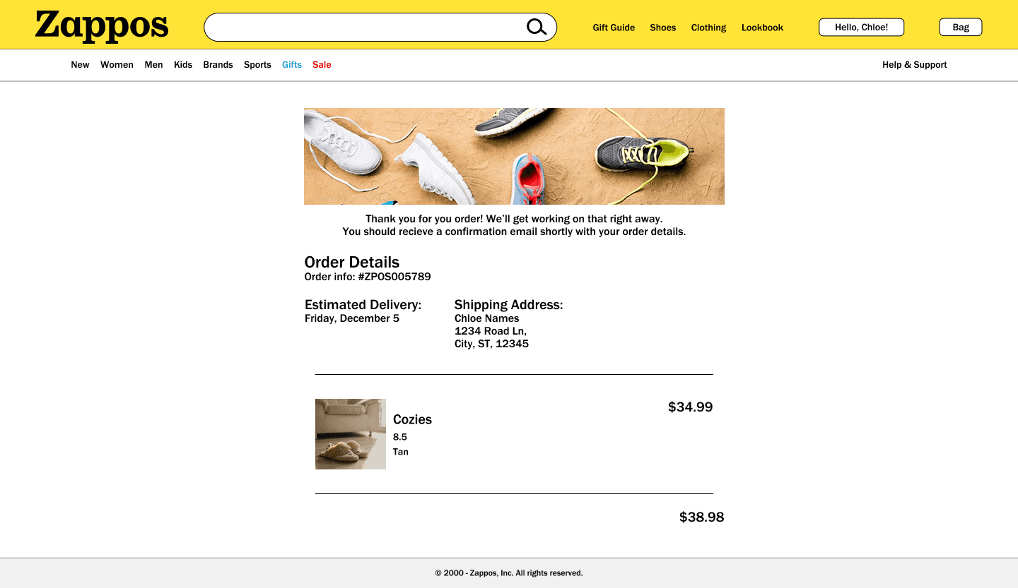
Finally, as of late 2025, the Zappos landing page is a largely black and white page with a promotional image front and center. By incorporating the official color palette Zappos already has established, the page can be given a more vibrant, energetic feel, a final touch that ties the visual experience together and leaves users saying "WOW."



The Process
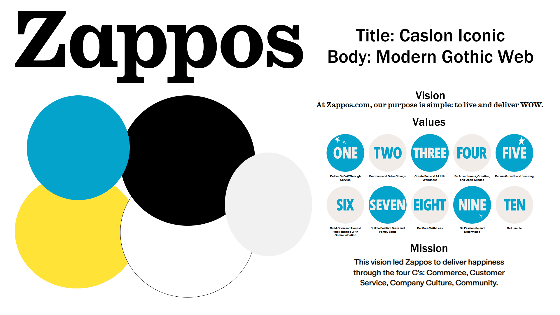
To begin, I needed to understand who Zappos was and what they do. I started by exploring their site and forming my own initial impressions, making a guess at what they were trying to accomplish before seeking out information from external sources, their own "About" page, and their demographic data. Once I had a foothold in their brand, I began collecting elements I could find consistently across their site: colors, fonts, spacing, styles, and recurring themes. The goal was to capture first impressions as they came, because clarity is key -what stands out immediately is usually what deserves the most attention.

With a clearer understanding of what Zappos does and what they want to convey, I mapped out a user journey and followed it myself, taking notes along the way. I logged where I wanted more, where things felt off, and where the process dragged. Using that same journey and end goal, I then completed the same process across three other sites to see how Zappos measured up. Those three sites were Amazon, Famous Footwear, and Designer Shoe Warehouse.
Each of these companies brought something to the table that Zappos' own process was missing:
Amazon was the strongest example of making efficient use of space, the entire process of shopping for a shoe could be completed in five clicks.
Famous Footwear was my standout for filters and product information; their filters remained consistent throughout the entire process, and they offered informed, curated suggestions along the way that made shopping feel guided rather than overwhelming.
Designer Shoe Warehouse did a great job of highlighting sale and promotional items in a way that felt straightforward rather than manipulative or pressure-driven.
It was during this competitive comparison that I stumbled into Zappos' connection to Amazon. Upon realizing that Whole Foods Market, another Amazon-owned company, was effectively Zappos' sister company, I decided to include it in my research as well, with a slightly modified user journey.
I simplified to: "purchase a product for delivery through an online portal," but differences were still stark. Whole Foods' process was far more streamlined, by pulling from information already saved in a user's Amazon account, a significant portion of the slower, more tedious steps are eliminated entirely. If the information already exists, there's no need to collect it again.
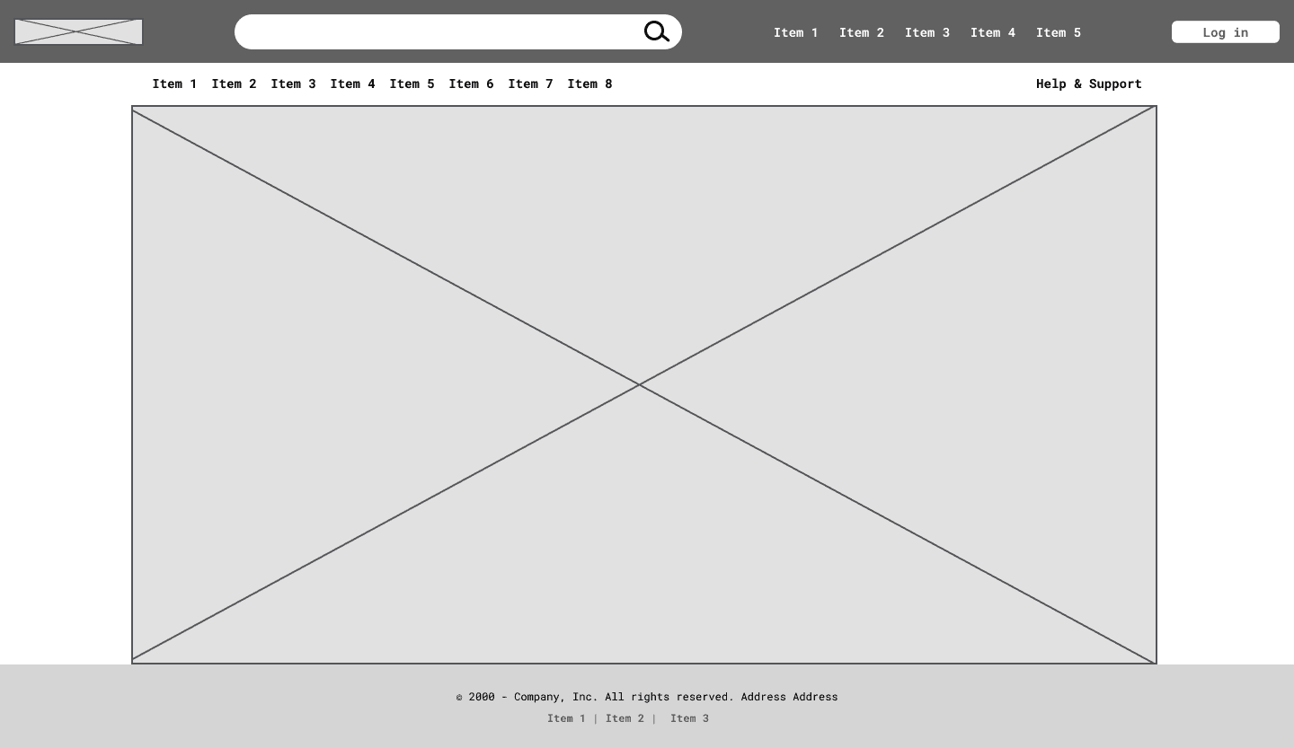
That discovery became the spark behind one of the strongest recommendations in this evaluation. With my findings and recommendations in place, I moved into building wireframes and prototypes to present for feedback.


The Reflection
I had never even heard of Zappos before the introduction of this project.
The only thing that really drew me to Zappos was the fact it I needed a new pair of shoes, and when I saw the site, I knew they would have shoes. Therefore, I actually bought a pair of shoes in my initial analysis of the shopping process, and I’m very glad I did (those shoes have found their way into my regular rotation of footwear). Admittedly though, we had a lot of wiggle room in how the project progressed, and while I’m very satisfied with the results, there are some weak spots that I wish had some stronger backing.
Due to the tight timeline, I only had the time to do some brief surveying of possible weak spots in Zappos’ process, so my research isn’t as fleshed out or solid as I’d like it to be; so I had to rely on statistics from secondary sources as my foundation.
And as much as I love how my prototypes came out, this was really it’s only iteration. I ended up going from a low fidelity prototype directly up to a high fidelity, and wasn’t able to gather a group to go through multiple rounds of testing to make sure I had presented the strongest solution I could.